Widget Catalog
Everything that can be displayed in the chat or on a report canvas.
Available Widgets
| Widget | Best for | Example prompt |
|---|---|---|
| Headline figure (KPI) | One number the whole answer turns on | "How many orders are in the extract?" |
| Table | A list, ranking or lookup to scan | "List every date field with earliest and latest date" |
| Vertical bar | Distribution across ordered bands | "Show order value in $25k bands" |
| Horizontal ranked bar | Comparing many named categories | "Rank nations by customer count" |
| Labelled bar | Few categories where exact numbers matter | "Customers by market segment, with numbers on bars" |
| Stacked bar | What a total is made of, over time | "Orders per year, split by status" |
| Grouped bar | Two or three series compared side by side | "On-time vs late orders per year, side by side" |
| Line | A trend over time | "Orders per month from 1992 to 1998" |
| Donut | Parts of one whole, four slices at most | "Share of order lines by return flag" |
| Scatter | Two measures per entity, to spot outliers | "Average order value vs order count, per nation" |
| Highlighted bar | One part emphasized against the rest | "Days late vs promise, with late side highlighted" |
| Written block | Headings, findings, caveats between visuals | "Add a short note explaining that chart" |
Widget Examples
Headline Figure (KPI)
One number, read straight from the query result — never rounded by hand.
Table
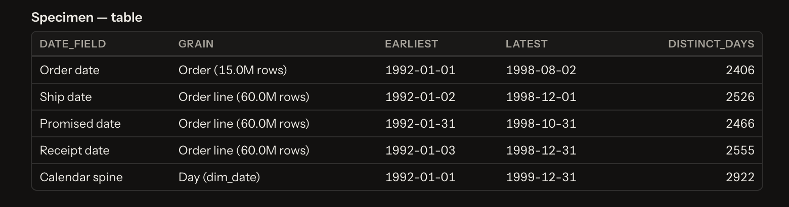
For anything to scan, sort or look up. Ask for more rows, fewer columns, or different sort to re-render.
Vertical Bar
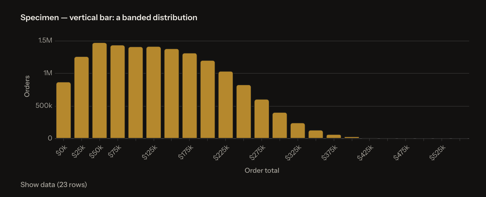
For distributions across bands — "$25k bands", "10-day bands", "by month". Bands stay in natural order.
Horizontal Ranked Bar
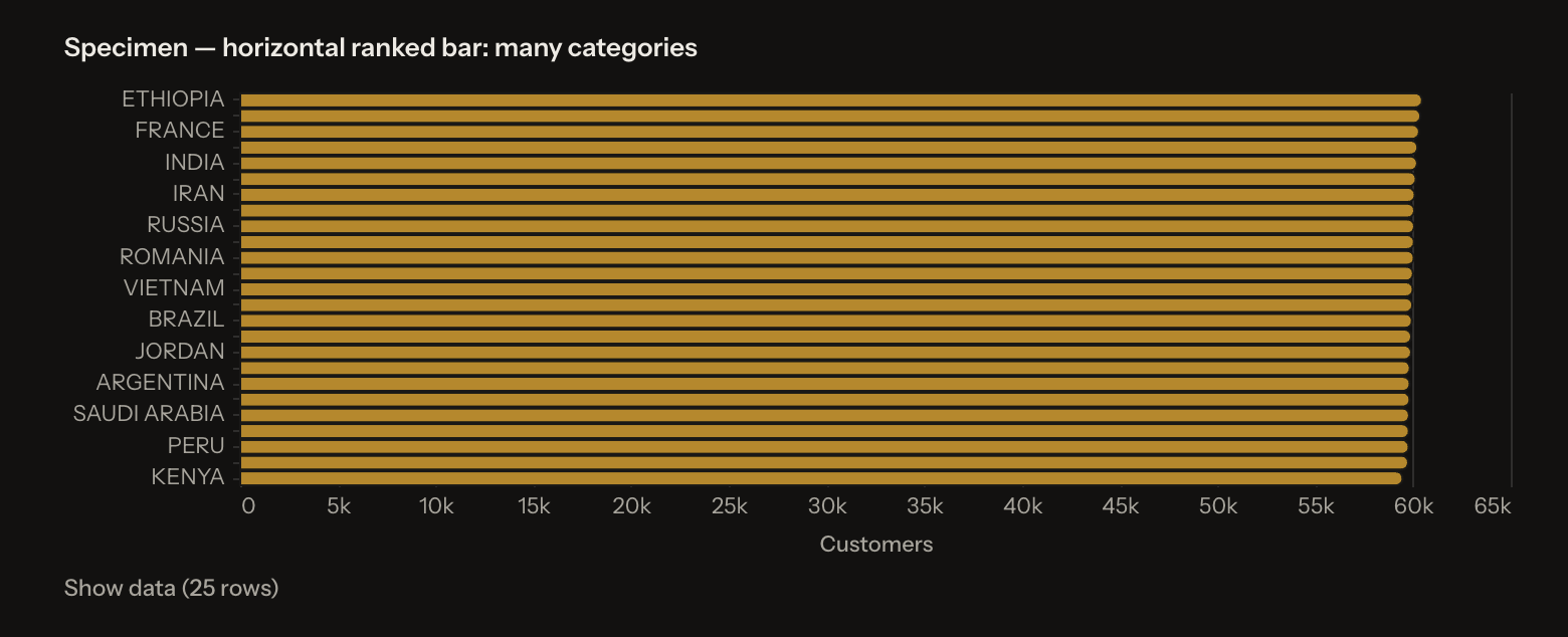
For named categories, ranked by value so the shape is visible at a glance.
Labelled Bar
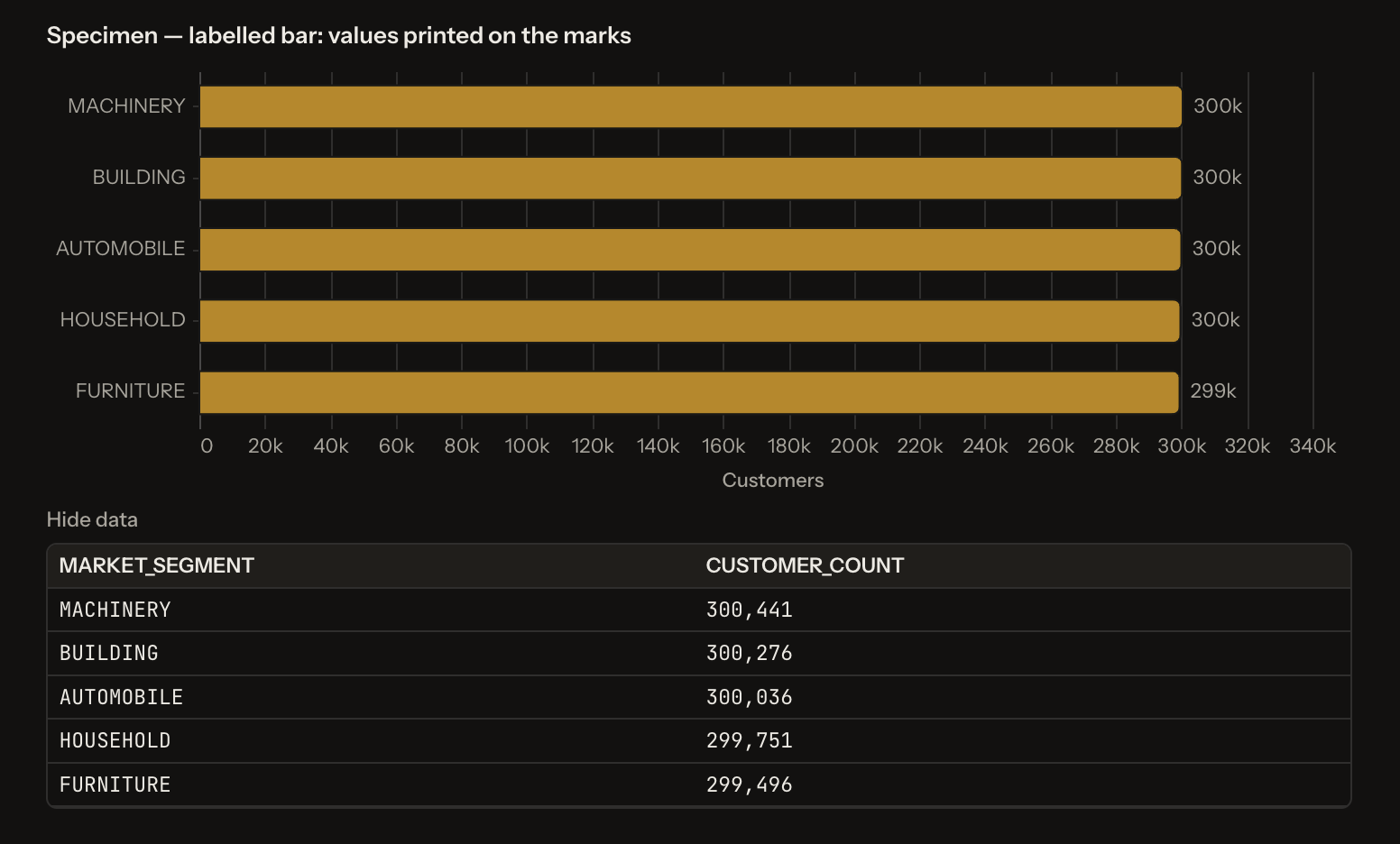
Under five categories — value printed on the mark, legend disappears.
Stacked Bar
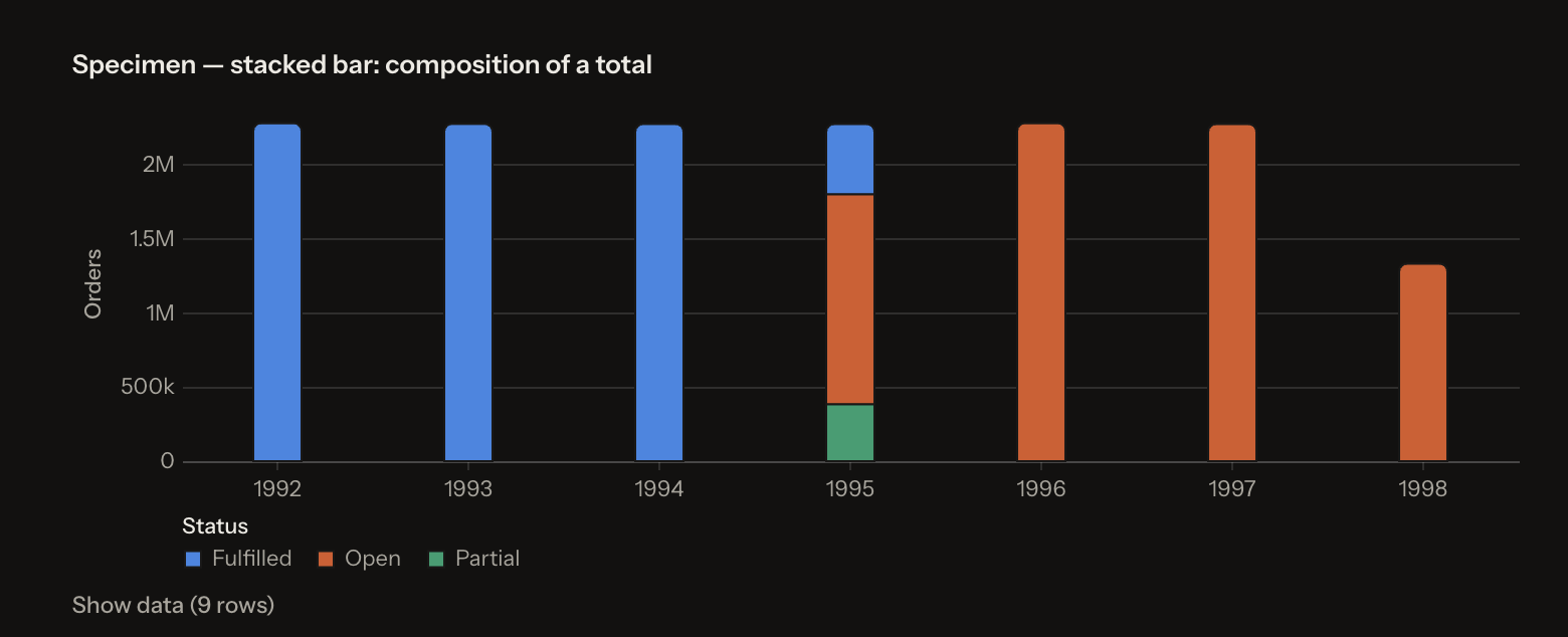
Answers what is the total, and what is it made of.
Grouped Bar
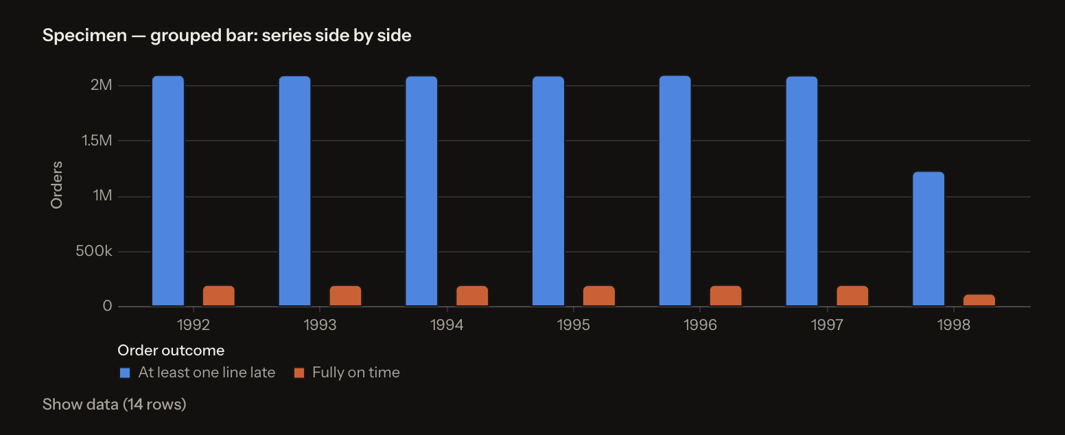
Answers how do these compare, one by one. Same data, different question than stacked bar.
Line
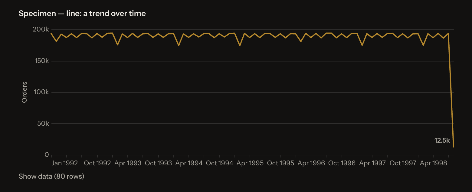
Always an explicit time unit. Last point is labelled instead of carrying a legend.
Donut
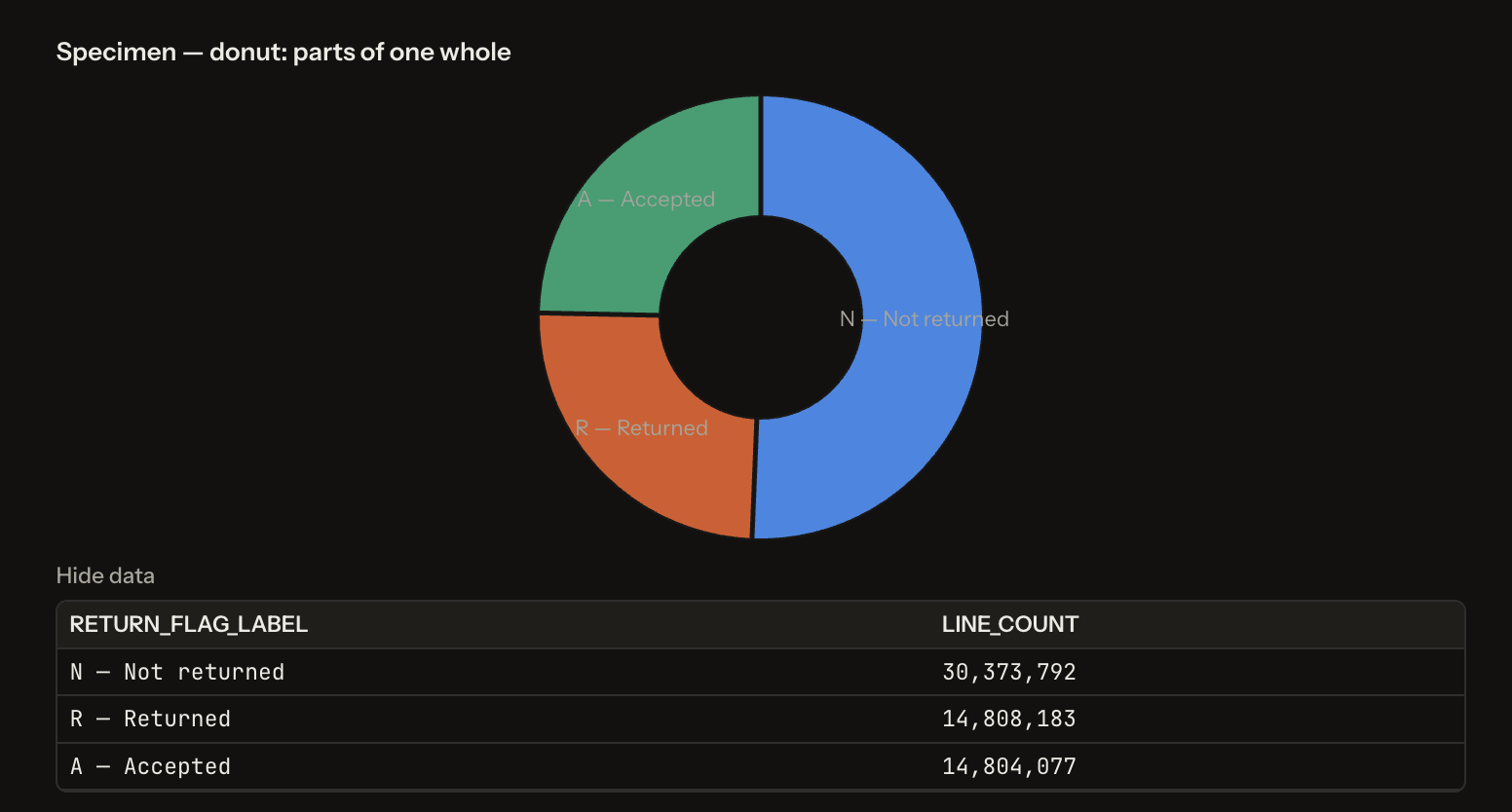
Four slices at most — past that, close angles cannot be ranked by eye and a ranked bar is the honest choice.
Scatter
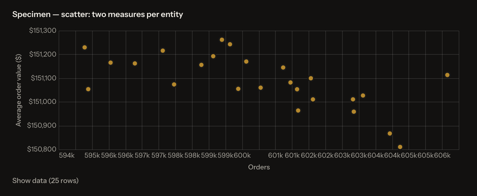
Two measures per entity, to find the outlier.
Highlighted Bar
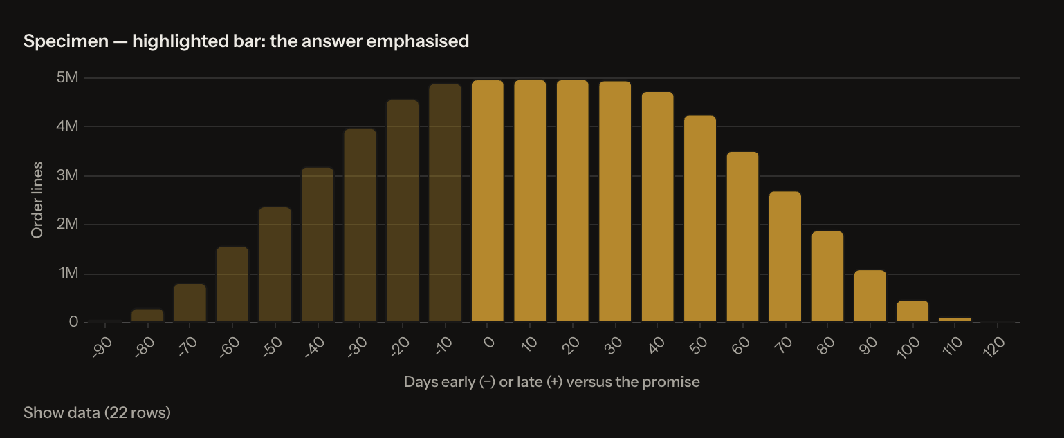
The question named one thing; the rest is context. Emphasis carried by opacity, not a second colour.
Chart Conventions
Fixed by the renderer (cannot be changed): colour palette, contrast, typography, axis styling, gridlines, legend placement, bar/line/point weights.
Yours to direct: chart type · axes · sort order · banding and grouping · highlighting · number formatting · titles and labels · value labels on marks · table row count · canvas block position.
Good to know:
- Large numbers abbreviated to human scale (4.97M, $29.3B) unless exact figures requested
- Two measures never share two y-axes — you get two charts or an indexed comparison
- Hover a bar, point or slice to bring it forward — no click-through, no cross-filter